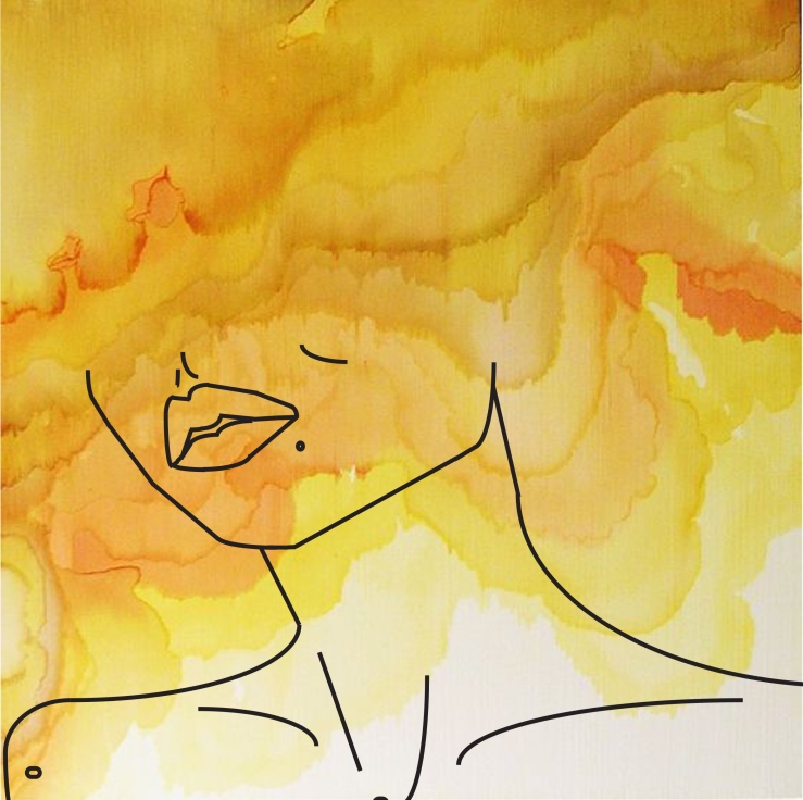
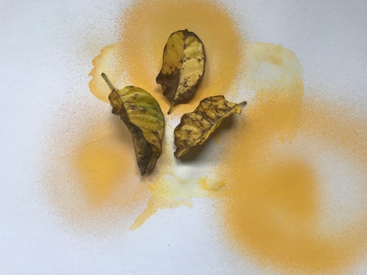
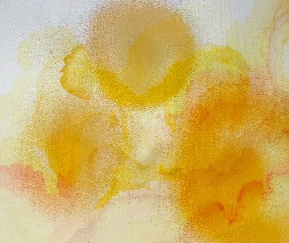
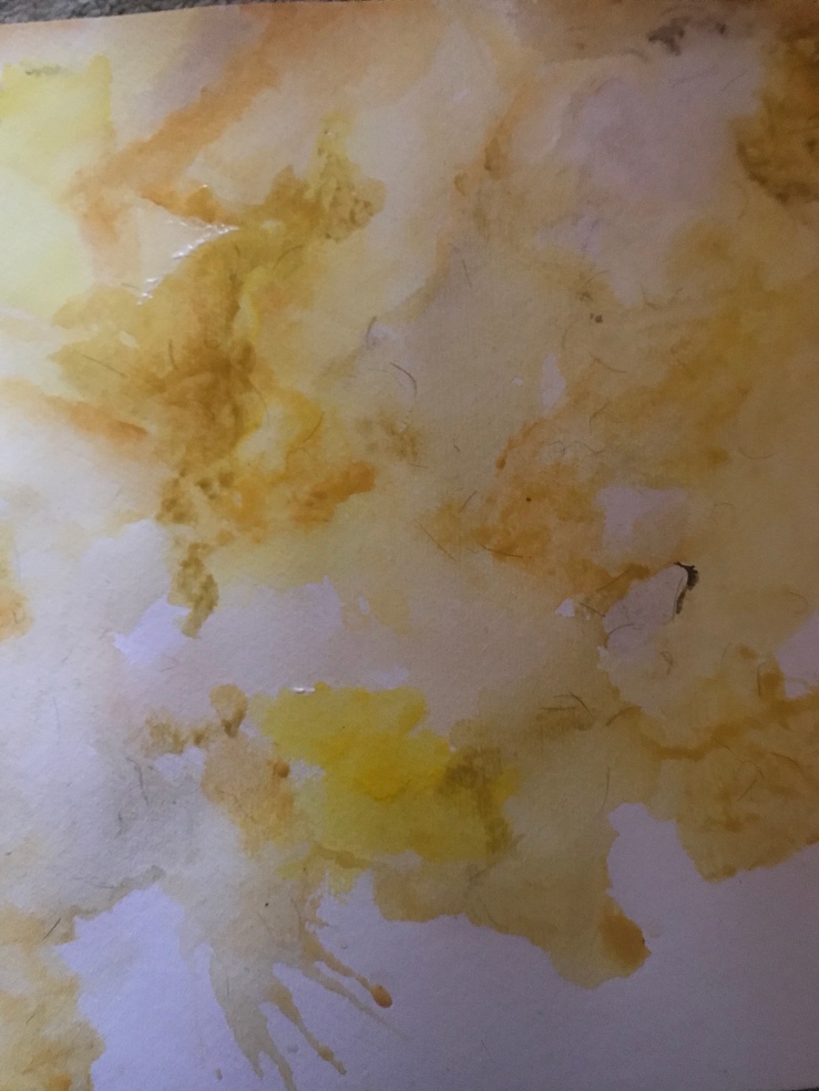
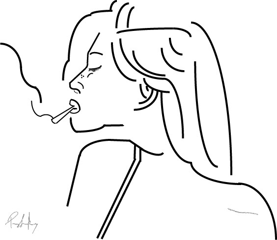
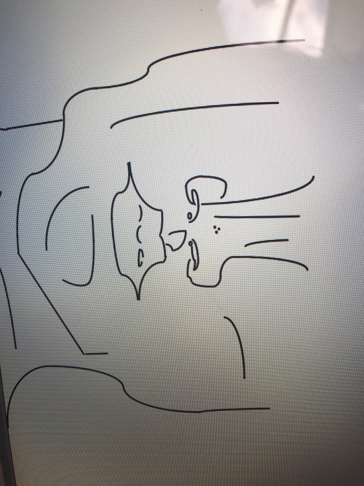
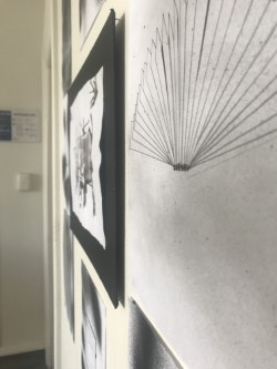
Image 1: When I was quite young my favourite thing to do at kindergarten was paint and draw. By the time I had left I think I had twice as many pictures as everybody else. My teachers really had to push me to get away from the tables and outside to play with the rest of the children. Now, looking back, I believe this is because painting and/or drawing is so hands on and allows me to be completely indulged and focused on one thing at a time. I was a energetic child, always running around. I was tested for ADHD multiple times, but the test never came back positive. The only way my parents/ teachers could get me to sit still and focus was to start painting. This allowed me to tune in and almost gave me tunnel vision towards whatever I was painting at the time. I believe this process of my early development really enhanced my drawing skills and perspective of space today. Seeing as I have been focused on repeating patterns and lines for a long time, this comes naturally to me now in adulthood.
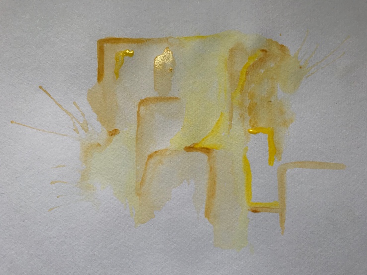
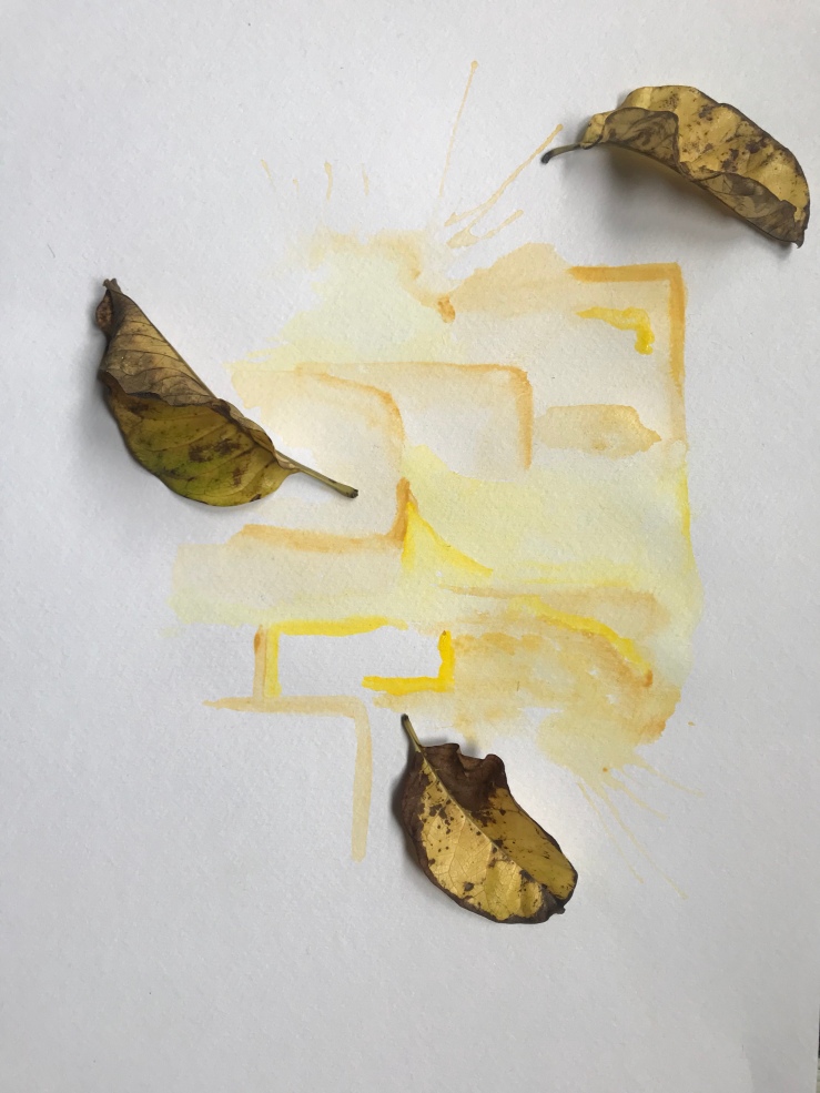
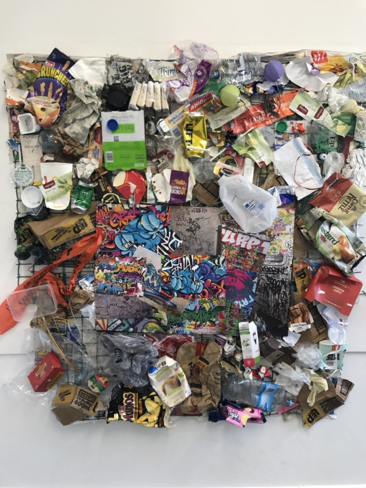
Image 2: After attending primary school and realising art was my favourite subject, I then chose this as my elective once I reached intermediate. As art history was also offered to the art extension students, I took this subject as well. I never intended to love art history but was compulsory to students undertaking and doing well within the art programme. By the end of first year (Year 7, 2008) I felt this was defiantly a subject I was interested in and good at. By the end of year 8, I had a mass knowledge of artists and how art had developed throughout the years. I believe this was a fundamental stepping stone in to my chosen career because I feel as though I could now relate my work to other artists and understand where my work was coming from and what directions I could take this in. While studying artists I developed a minor obsession with Claude Monet.
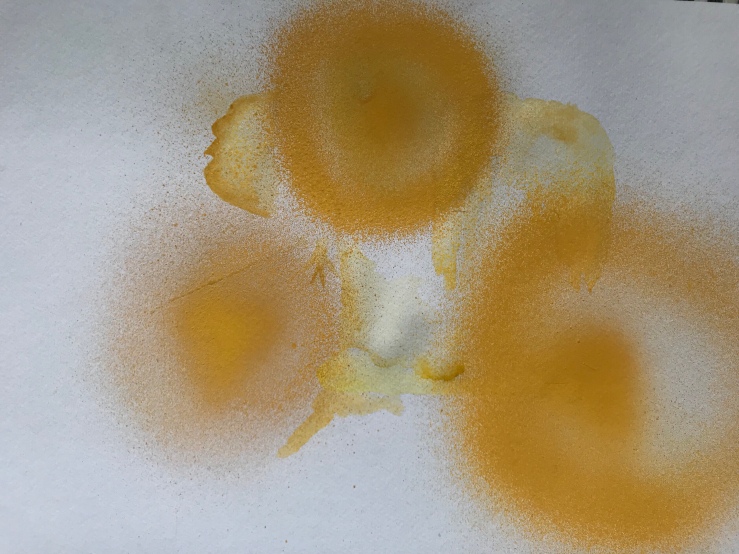
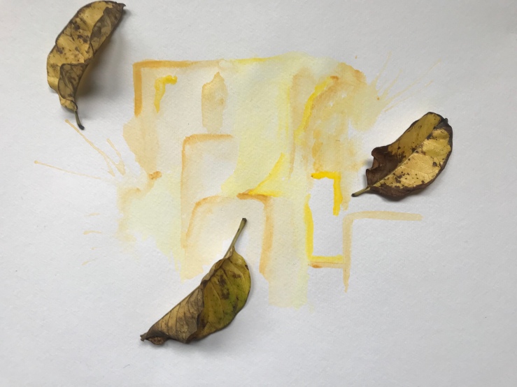
Image 3: This painting, ‘Water Lilies’ painted by Monet in 1917 was my absolute favourite painting completed. I tried to replicate this myself. At the time, I had no idea why I was so obsessed with Monet and this painting, but now I can see why. At the time (2008) a lot of my painting and drawings had been experimented using sponges. My teacher would get us to test out different shapes, textures, thickness of paint etc… I then decided to start collaging the different sponge materials to make a image. Mostly scenery. Thinking back a lot of my works are based on or formatted around this image. The use of texture and simple colour create a realistic image expressing water lilies and the pond. Monet was also highly critiqued on his amazing perspective drawing for the time. He would so simply outline all shapes enforcing his correct perspective placement. Without realising this technique was what I had picked up and used a lot throughout my own works. I believe his style and use of simplicity created a natural beauty that I found inspiring and wanted to portray more of in my works.
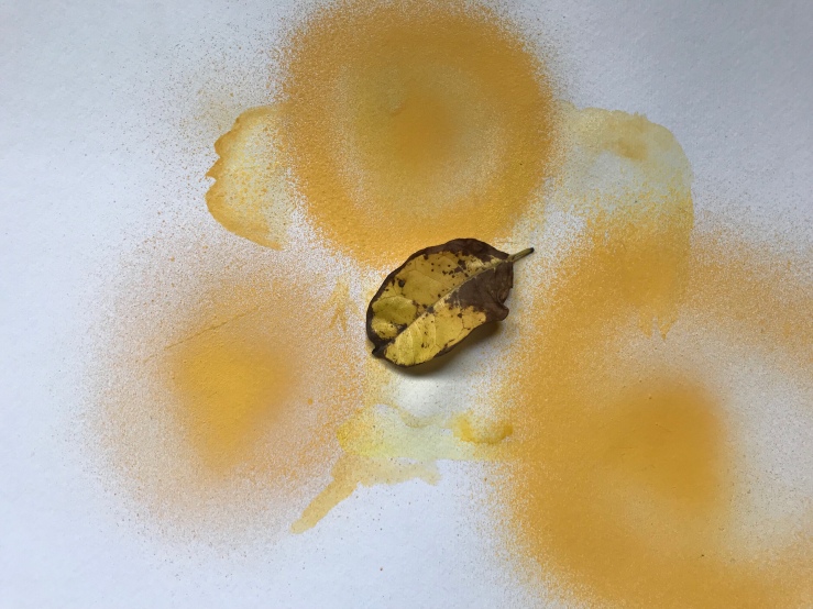
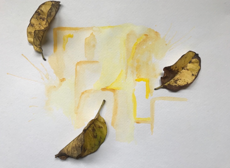
Image 4: When I was younger, my brother, mum and I moved around a lot because of her work. She is a producer within the film industry and this allows us to visit a lot of cool and different places. After maybe the third move, I decided that I wanted to set up my new room in a way that I could easily pack back down. I felt as though we moved around a lot we lost a lot of valuables, we didn’t get as connected to items as some, and I was always tossing and clearing out my wardrobe and tossing out toys. This became a passion of mine. Designing new and interesting ways to set up my room. I would colour wallpaper, paint new pictures, dye my duvet covers. This was a way of starting fresh for me. New room, new town, new Peggy. After a while, I became good at filling and redesigning space. I remember being about seven years old and my mum asked me to help design the house. We would fill in space using different angles, try out new colour schemes, plant vibrant coloured plants and make new paintings and ornaments for the walls. Whatever we could do to make ourselves feel compoftable and at home. By doing own own art and designing the space the way we wanted to, this allowed us to have our own personal connection to the home we were living in. It also allowed us to spend quality time together and what better way than to paint on a sunny day then hang your masterpiece in the lounge of your new home. After the third or fourth move mum said to me that she thought I was really good at this. I decided this was a good career option for me as it excites me, and I felt so satisfied at the end of design. I started to consider career options surrounding this and then added Interior Design to my list. Knowing nothing about interior or spatial design I started watching a programme called George Clarks Amazing Spaces.
Image 5: George Clarks show ‘Amazing Spaces’ became a huge part of my career choice. I remember watching my first episode and being so intrigued by the architecture and interior design skills it would take to create such utilising small spaces that everyday people can use for multiple purposes. The first episode I watched was an apartment complex built in London. Shipping containers stacked on top of one another creating the exterior of the building and rooms in the centre. The shipping containers are roughly 8 ft. tall and 8 ft. wide which amazed me! They had managed to fit in a bedroom, lounge, kitchen and bathroom. This is when I realised this is what I want to do career wise. Make people feel comfortable in their homes no matter the size or cost of the project. I wanted people to come home to relax and be able to say they wouldn’t change anything about it. This show also gave me some really good idea’s while designing my own spaces. The storage idea’s I have for my clothes and shoes are used from George Clarkson’s show. I have pull out cupboards from underneath my bed that I designed myself. These containers/ drawers then cane be pulled out, lid put on and in to the moving truck. My whole room could be packed up within about ten minutes. Career wise, this is what I want to do. Interior/ Product design. Be able to help people really enjoy the spaces they are living in and use the space to its maximum capability!
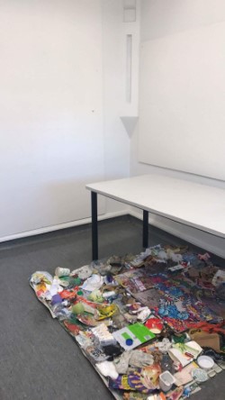
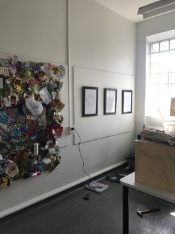
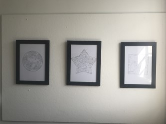
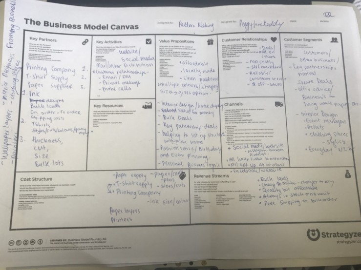
Image 6: After piecing the room together and placing all furniture, I always want to decorate the room with my own artwork to make it more me. This also means I can use multiple prints for multiple purposes. This results in the use of textures and colours to really bring the room together and control the environment. I believe nearly every room set up I draw one or two new pieces of art. Usually, I use my doodles from the past couple months and repeat this repeatedly in a basic shape. Eg. Circle, Square or star filled with roses or diamonds. I started to do this as I only had two frames and would create new prints to fill these for my new room. When I realised that multiplying and manipulating my drawings were having an amazing outcome, I started to make lots. To me, these are now not prints, these turned into my patters. I have maybe 50+ patterns over the past 4 years of making. After drawing a new one, I will replace it in the frame and add the old pattern to the pile. For me, this technique works wonders and connects back to my career choice interior design. As I start to develop my own format to interior design I want to start using my own patterns within my client’s homes. E.g. Cushions, couches, curtains, prints, paintings etc.. This is a hobby for me but is turning into a major factor towards developing and standing out within my chosen career.
