Set up/ Installation of Exhibition

The first step of installation, was clearing and removing all furniture and art works from our studios. I then started to place my formations on the ground before hanging to imagine the exhibit before hanging.

thumbnail_IMG_2472.jpg

The next step was to start hanging all my works in formations that show off the best attributes the artworks have. This will ensure my viewers understand my exhibit and can walk through the works while also understanding them.

thumbnail_IMG_2474

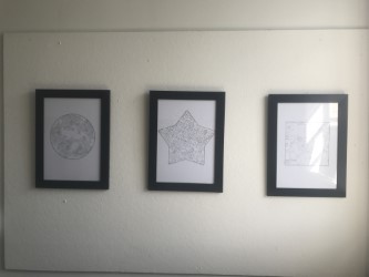
My next step was to start formatting my prints/patterns. Originally I hung them unframed to see how the light would play next to the window. The light did nothing but hit the prints and bounce off a yellow tinged light that made my prints look as though I had spilt tea on them. I then decided to buy frames and frame then, in order for the light to bounce bak off. This worked successfully.

thumbnail_IMG_2484

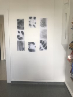
The next installation to hang were my ‘Shuffle” prints I had created at the start of the semester (semester 2 2017). These were tricky to hang as I couldn’t decide on a correct formation. I played around for a couple days. Experimenting with different hanging positions and first off felt like this was the best way to place the prints. I had also attached my hanging piece to the side of the installation to keep the ‘Shuffle’ works together.

thumbnail_IMG_2473.jpgthumbnail_IMG_2478

The next day, I returned to uni and though these looks really off and decreased the value of my exhibit. I then found an old foam black board and placed one of the prints in the centre. This added a lift to the whole ‘Shuffle’ piece.thumbnail_IMG_2480

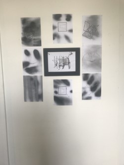
I then elevated the middle section by hanging it just off the wall. Sticking out by about two cm. This added a pop to the section of the wall and also elevated the word ‘Shuffle’ once again.thumbnail_IMG_2481.jpg

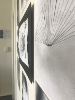
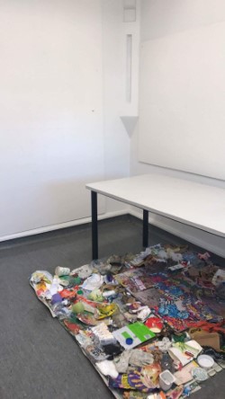
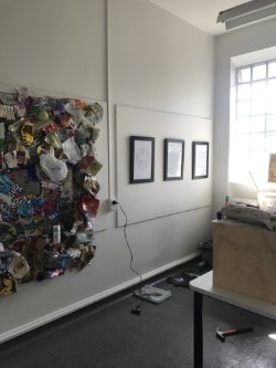
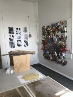
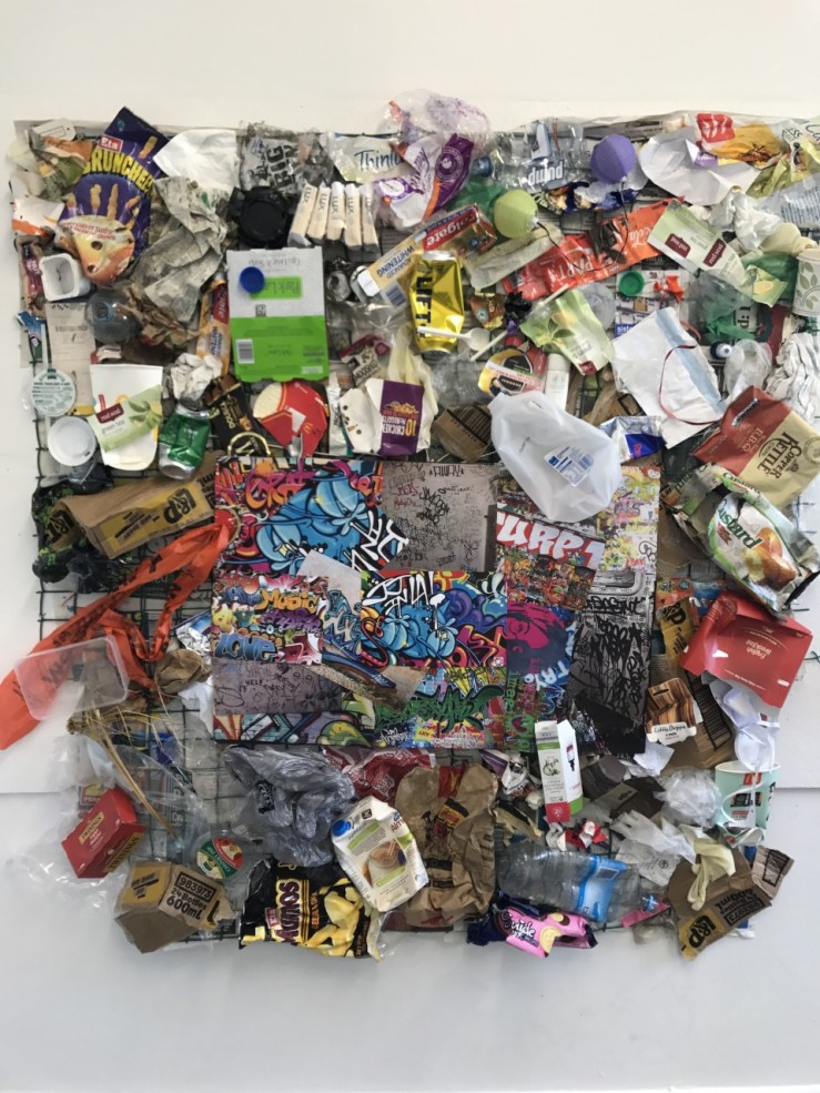
The next to hang was my ‘ Urban Chaos’ rubbish tapestry. This section for me was the scariest. The backing is made out of newspaper and I was worried that it wouldn’t hold. Seeing as I was the only one in the building I had to also hang this by myself and straight! It became a massive task. But after hamming the top nail in the centre and rushing around nailing the rest, it has managed to hold and maintain its shape. I was very relieved with this.

thumbnail_IMG_2450

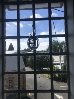
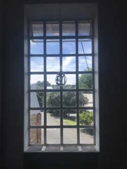
After clearing and finishing all my hanging works, I was observing the room and thought I would move my ‘Shuffle’ hanging piece in to the window. The light play bounces beautifully and gives a finished look to the end of my section of the studio. The globe started spinning and the patterns were bouncing on the walls. This was perfect. This is what my finished piece looked like:

thumbnail_IMG_2486

thumbnail_IMG_2487

Creativity and Design- Research Magazine

Research Magazine-Creativity and Design

The above link is the research assignment task to match our project for creativity and Design. I chose to complete this assignment in the form of a magazine created on Indesign. When viewed please view as two pages.

I chose to use this format as the project I undertook is messy and unclean. This made my project look sophisticated and allowed me to annotate the research and decision making that occurred.  I have also printed a copy of my magazine that will be left in my studio alongside my rubbish tapestry. This is so the audience can read through my process of this project and understand the meaning behind the chaos.

Reflection:

Throughout this process I’d really focused a lot on patterns and layering and wanted to find artists who sort of did the same. For me, shuffle my verb was a movement, almost like some thing is being unfolded. I found two main artists that I stuck with, both on Pinterest. These two lead me to other artists’ patterns eventually but I started here.

The first was Charles Kalpakian. He made these walls of rectangles that glowed and showed depth and structure using light. They look like they are 3D but his main focus is to outline the shape using dark and light shadowing, making it lost like they are almost shuffling across the page.

The second was Donald Judd. An architecture specialising in creating tight but comforting spaces. His houses/ building are all blocks with big gaps of lighting making the hallways and rooms look a lot bigger than the actually are. He can make a ten foot hallway look 100m long but adding light gaps and angling the square walls around the hallways. His work looked as though it were shuffling to me because the space continually carried on angling and folding over itself.

In the brief we were asked to really focus on positive and negative space, which I’ve really tried to do without my works. Using harsh blacks and clearer whites I was able to show contrast and texture between the two using a range of different mediums. My main mediums were spray paint, collage and layering of patterns. I loved this task as it challenged me to think and use things I would never have used before but also develop my work further and further.

Creativity and Design : Week 4 Tactile mixed with Digital

Below are my personal favourite ten from mixing my tactile and digital elements. I decided to mainly go with contemporary art during this week as it will be a challenge for me I used a lot of collage and experimentation with materials during this week. I wanted to stick with the theme of my works using spray paints and more rectangular block work but in a different way. Instead of all my work looking so clean and precise I decided to make it rough and edgy. Eg. scrunching up paper, sticking things over top over others and playing around with tape and paints. Here is the result:

This slideshow requires JavaScript.


Creativity and Design Week 3: Model’s and Photography

From the verb shuffle I was given the task to create models to best describe the verb. I came up with three ideas. First is Spiral. To create the model I cut out a lot of frames and stuck them together as if they were a shuffle hand of cards or if the cards were falling out of someone’s hands. This is the result:

This slideshow requires JavaScript.

The next model I’ve made is the Glass shuffle. I wanted it to look like cards or rectangles being shuffled and thrown up into the air. The best way to show it was in a 360 model. I chose to use a glass dome so you can look inside and it looks like your surrounded by flying rectangles thrown into the air above you. An unexpected outcome was that once I turned a dim light on it actually reflected rectangles onto the walls at night time. Here is the result:

This slideshow requires JavaScript.

The third model I made was a Shuffle I wanted this model to have a solid substantial background so i used a piece of wood that i’d painted black. After spray painting cards i wanted to scatted them in order to look like they were thrown on the the grown and forgotten about in a pile. They way I placed and painted them also looks like kind of spacey like they are alone.:

This slideshow requires JavaScript.

My Favourite ten photographs would have to be the ones below. These are my best because they are all in focus and really get the point across to my viewers of the theme or goal I was trying to achieve:

This slideshow requires JavaScript.


Creativity and Design: Week 2 Digital

For the second week we were to do the same thing but using digital technologies. Sticking to the word shuffle, i played around with some of my own patterns and also experimented with new ones mainly using Photoshop. This was the result:

This slideshow requires JavaScript.

I believe my ten best were the ones shown below. I believe they are the best because they best represent my word assigned shuffle but also they are more thought out and planned to how I wanted them presented:

This slideshow requires JavaScript.

Creativity and Design : Week 1 Tactile

Week one of a four week project. Task is to create a number of works from the verb you were assigned during class. Mine was : Shuffle. This weeks task was to create a numerous amount of works using only black, white and grey tonal elements to really show and express the positive and negative space. Below i’ve added my all my works made:

This slideshow requires JavaScript.

We were then asked to select what we though were the ten best. My ten best show negative and positive space expressing the verb shuffle. I’ve used different tactile techniques to test out new ways of working and trying new materials: